Hanging cards
ProContentv1.0.0
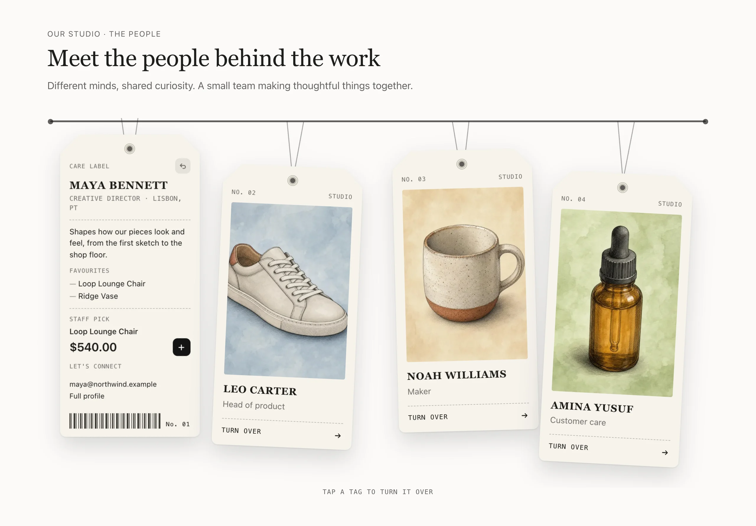
Introduce the people behind your brand on hang tags. Each tag hangs from a slim rail on a loop of string through its eyelet, tilted and gently swaying; hovering straightens and lifts it. A click or tap turns it over to a care-label back with their role and place, a short note, a short list, a staff pick with its price set large like a price tag and an Add to cart (a link to the product when it has options or is sold out), an email and a profile link, finished with a barcode and the tag's number. Use it for your team, your makers, your stockists or customer stories. More tags than fit scroll sideways along the rail.
Good for: Meet the team · Meet the makers · Staff picks

When to use it
Use it on an About page or your home page to introduce the people behind your brand: your team, your makers, your stockists or customer stories.
- Faces before details. Each person hangs on a tag with a photo, a name and a role. Shoppers turn a tag over with a click or tap to read more, so the section stays short until someone is curious.
- A product with every story. The back of a tag can hold a staff pick with its price and a button, so a recommendation from a real person is one click from the cart.
- A way to get in touch. Add an email address and a link to a full profile, for stockists or customers who want to reach that person.
Set it up
Add the section
On your home page or a page template, choose Add section and pick SU: Hanging cards. It starts with four Tag blocks.
Fill in the front of each tag
Select a Tag block and add a Photo, a Name and a Role. These show on the front. Add another Tag block for each person, up to 8.
Fill in the back
Under Back of the card, add any of these. Empty fields are left out.
- Location shows next to the role.
- Short bio is a few sentences about the person.
- List heading and List make a short list, one item per line. Only the first 3 lines show.
- Staff pick is a product, shown with its price.
- Email, plus a Link with its Link label, for example to a full profile page. They sit under Contact heading on the back (Let’s connect by default; leave it empty for no heading).
Check how the staff pick is bought
A staff pick with a single variant gets an add button on the tag. A product with several variants, or one that is sold out, gets an arrow that goes to its product page instead. Under Motion, After adding to cart chooses whether the cart opens or shoppers stay on the page.
Choose how many tags show at once
Under Cards, set Tags in view on desktop to 3, 4 or 5. More tags than that scroll sideways along the rail. You can also rename the labels printed on the tags, such as Label on the front, Label on the back, Flip button and Product heading on the back, or turn off Number the cards.
Set the motion
Turn off Tags sway gently for still tags, or Straighten and lift tags on hover to stop tags reacting to the mouse. Shoppers who prefer reduced motion always see still tags.
The back of a tag has limited room. Keep the bio to about three lines; longer content scrolls inside the tag.
Try it
Settings
In the theme editor, in the order you'll see them. Every section also has the heading and style settings.
Cards
| Setting | What it does |
|---|---|
| Tags in view on desktopDropdown | More tags than this scroll sideways. |
| Label on the frontText | |
| Label on the backText | |
| Number the cardsCheckbox | |
| Flip buttonText | |
| Product heading on the backText | |
| Contact heading on the backText | |
| Hint under the cardsText |
Motion
| Setting | What it does |
|---|---|
| Tags sway gentlyCheckbox | |
| Straighten and lift tags on hoverCheckbox | Shoppers who prefer reduced motion see still tags. |
| After adding to cartDropdown |
Blocks go inside the section: use Add block, up to 8 in all, and drag them to change the order.
Block: Tag
| Setting | What it does |
|---|---|
| PhotoImage | |
| NameText | |
| RoleText | |
| LocationText | |
| Short bioMulti-line text | |
| List headingText | |
| ListMulti-line text | One item per line, up to 3. |
| Staff pickProduct | Shown with its price and an Add to cart button. |
| EmailText | |
| Link labelText | |
| LinkLink |
Good to know
- Up to 8 tags.
- The back holds a short note (3 lines), up to 3 list items, one staff pick and one email and link; longer content scrolls inside the tag.
- Without JavaScript the fronts show; flipping to the details needs JavaScript.
Changelog
- 1.0.0: Initial release.