Product comparison
ProProductv1.0.0
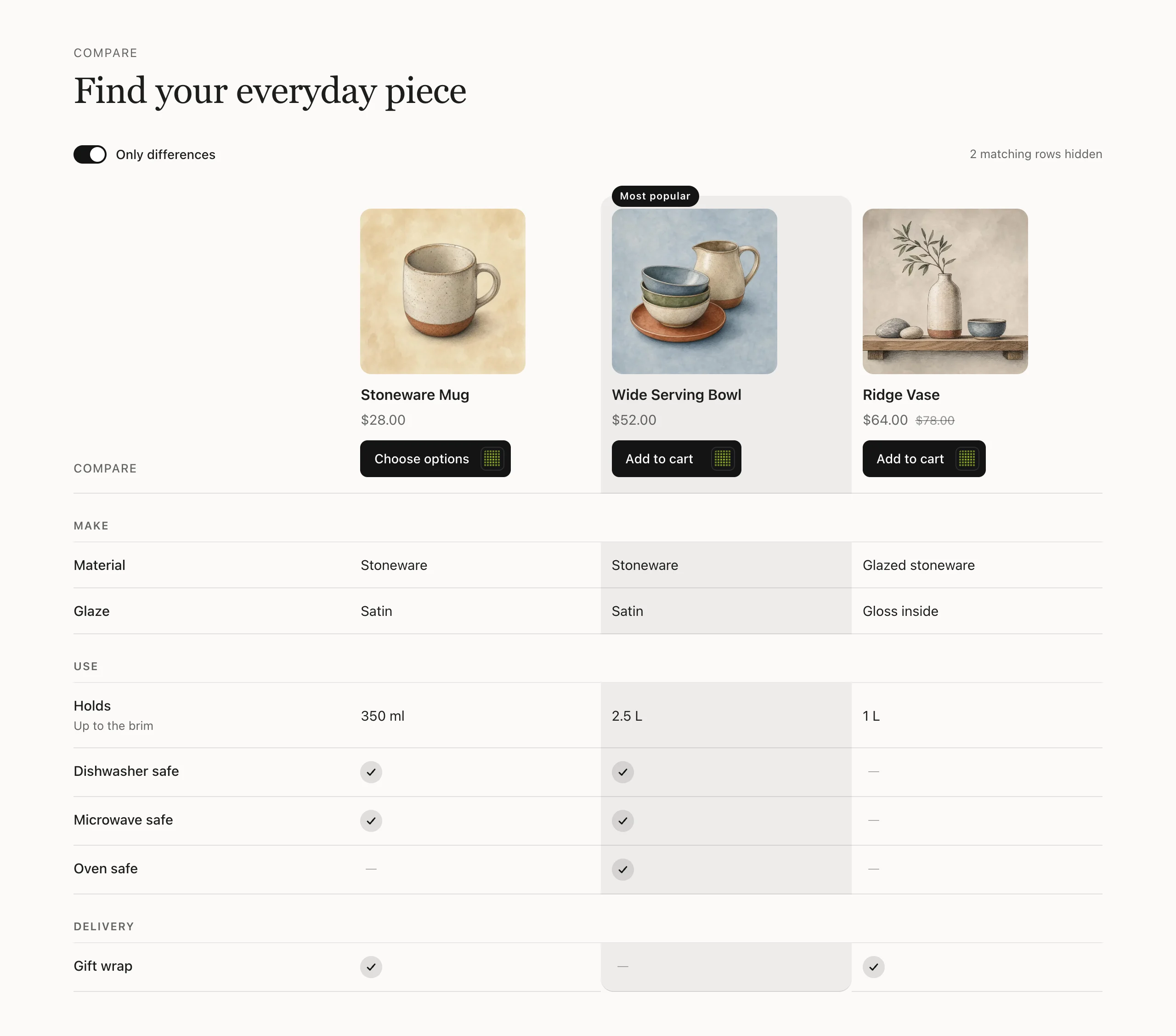
Help shoppers choose between similar products. Pick up to four products for the columns and add a row for each feature: type the values in or read them from a product metafield, with yes and no shown as a tick or a dash, and group rows under headings. The header with each product's image, price and Add to cart (with an option picker) stays in view while shoppers scroll, one column can carry a badge such as Most popular, and an Only differences switch hides the rows where every product matches. On phones the table scrolls sideways with the feature names pinned.
Good for: Compare models or sizes · Plan or bundle comparison · Product specs table

When to use it
Use it on a product page, a collection page or a buying guide, wherever shoppers hesitate between a few similar products.
- The choice in one table. Each product gets a column and each feature a row, so shoppers see what sets them apart without opening several tabs.
- Buy from the table. The header with each product’s image, price and Add to cart stays in view while shoppers scroll. Products with variants open an option picker first.
- Only what’s different. An Only differences switch hides the rows where every product is the same, so the real trade-offs stand out.
Set it up
Add the section
Choose Add section and pick SU: Product comparison. It starts with three example rows and example columns until you pick products.
Pick the products
Under Products, choose up to 4 in Products to compare. They show as columns in the order you pick them.
Highlight one product
Set Highlight a product to the column you want to stand out (First to Fourth, or None) and type its badge in Badge on the highlighted product, for example Most popular.
Add a row for each feature
Select a Row block and type the Feature name, plus optional Help text shown under it. Then fill in Product 1 to Product 4, one per column in the same order as your products.
Type Yes or No to show a tick or a dash. A value you leave empty also shows a dash.
Or read values from a metafield
If your products already store a feature in a product metafield, enter its namespace.key in Read from product
metafield, for example custom.material. For each product that has the metafield, its value replaces what you typed
for that column. True and false metafields show as a tick or a dash, and lists show as comma-separated text.
Group rows under headings
Add a Group heading block above a set of rows, for example Size or Care. Drag blocks to put headings and rows in order. You can use up to 30 blocks in total.
Choose the table options
Under Table, keep Show an “Only differences” switch on to let shoppers hide matching rows. Look sets Blend with the theme or Card, and After adding to cart chooses Open the cart or Stay on the page.
Use metafields that hold text, numbers, true or false, rich text (shown as plain text), references (shown by their title) or lists of these.
Try it
Settings
In the theme editor, in the order you'll see them. Every section also has the heading and style settings.
Products
| Setting | What it does |
|---|---|
| Products to compareProducts (up to 4) | Up to 4, in column order. |
| Highlight a productDropdown | |
| Badge on the highlighted productText |
Table
| Setting | What it does |
|---|---|
| Label above the featuresText | |
| Table name for screen readersText | |
| Show an "Only differences" switchCheckbox | |
| LookDropdown | |
| After adding to cartDropdown |
Blocks go inside the section: use Add block, up to 30 in all, and drag them to change the order.
Block: Row
| Setting | What it does |
|---|---|
| FeatureText | |
| Help textText | |
| Read from product metafieldText | namespace.key, for example custom.material. When a product has it, it replaces the value typed below. |
| Product 1Text | Yes or No show as a tick or a dash. |
| Product 2Text | |
| Product 3Text | |
| Product 4Text |
Good to know
- Up to 4 products and 30 rows.
- Metafield values can be text, numbers, true/false, rich text (shown as plain text), references (shown by title) or lists of them.
- Without JavaScript every row shows; the Only differences switch is hidden.
Changelog
- 1.0.0: Initial release.